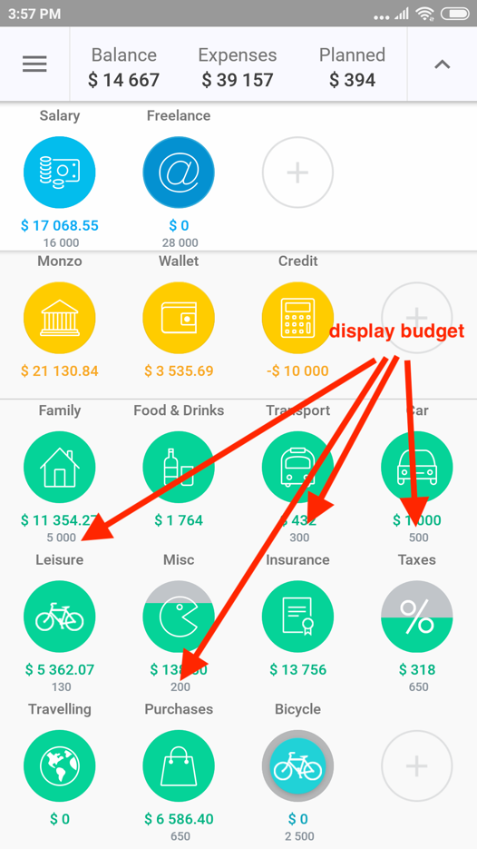
In the field of "I Plan to Spend" at creation / editing categories of expense or income you can specify the budget for this category for this month (or any other reporting period).
By default, this planned sum is displayed in gray color under the relevant expenses and under the category icon. In the Menu section —" Settings" — "Display budget” you can turn off this option.
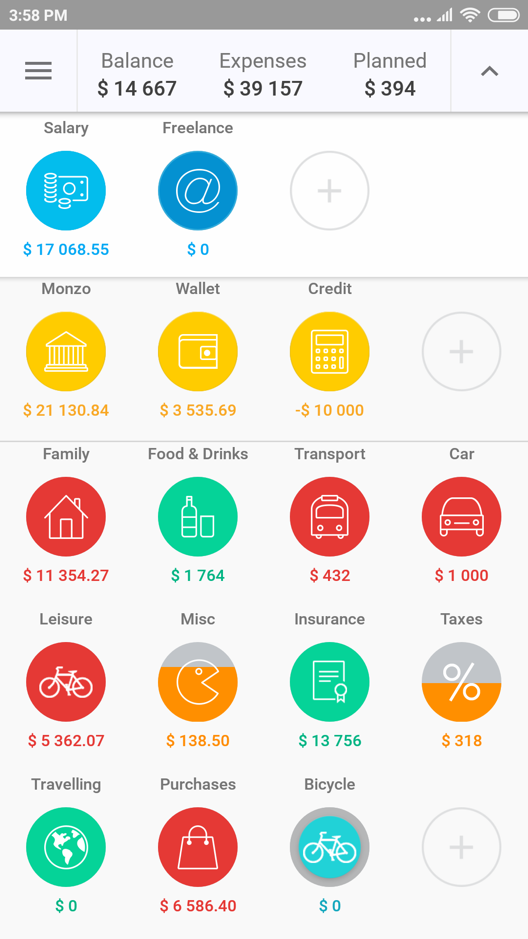
Therefore, these gray sums of limits on the categories will not be displayed on the main screen, and you will only see the sums which you’ve already spent during this reporting period. However, icons of expense categories, as before, will continue to be painted in different colors to show how fast you approach a limit of expenses.
- Green color means that you spend less, than could in the current reporting period.
- Orange - that you spend slightly quicker, than you should. If you do not spent for this type of expenses too often, then the color of the filling will also be yellow.
- If the category is filled red, then you strongly exceed the rate of expenses on this category, or already spent all set limit. The icon in this case will be completely filled.


